SafeArea
SafeArea is a specialized control that overrides the Padding or Margin properties of its child/attached control to ensure that its inner content is always within the ApplicationView.VisibleBounds rectangle.
The ApplicationView.VisibleBounds is the rectangular area of the screen which is completely unobscured by any window decoration, such as the status bar, rounded screen corners, or any type of screen notch.
SafeArea can also be used to specify certain areas of the UI that should adapt its layout in order to avoid being covered by any sort of soft-input panel, such as the on-screen keyboard. This is done by observing the state of the keyboard and treating the area that it occupies when open as part of the "unsafe" area of the screen.
In some cases, it is acceptable for visible content to be partially obscured (a page background for example) and it should extend to fill the entire window. Other types of content should be restricted to the visible bounds (for instance: readable text, or interactive controls). SafeArea enables this kind of fine-grained control over responsiveness to the safe and "unsafe" areas of the screen.
Properties
Remarks
SafeArea can be used as a control or as a set of attached properties on another FrameworkElement, much like the ScrollViewer:
xmlns:utu="using:Uno.Toolkit.UI"

<!-- as attached property on another FrameworkElement -->
<Grid utu:SafeArea.Insets="Left,Top,Right,Bottom">
    <!-- Content -->
</Grid>

<!-- or, as a control -->
<SafeArea Insets="Left,Top,Right,Bottom">
    <!-- Content -->
</SafeArea>
Warning
Always wrap form inputs with SafeArea when using TextBox or PasswordBox
On mobile devices, the on-screen keyboard will obscure input fields unless you wrap them with SafeArea using Insets="SoftInput" or Insets="SoftInput,Bottom". This is especially critical for login forms and any page with text entry controls.
<utu:SafeArea Insets="SoftInput,Bottom">
    <StackPanel>
        <TextBox Header="Email" />
        <PasswordBox Header="Password" />
        <Button Content="Login" />
    </StackPanel>
</utu:SafeArea>
Warning
In most cases, the attached properties and the SafeArea control can be used interchangeably. However, be aware that using SafeArea as a control while Insets contains InsetMask.SoftInput will introduce a ScrollViewer into the visual tree as the content root of the SafeArea. Please refer to the SoftInput usage section.
| Property | Type | Description |
|---|---|---|
Insets |
InsetMask |
Gets or sets the specific bound(s) of the "safe" area that you want to be considered when SafeArea attempts to apply the Padding or Margin. Defaults to InsetMask.None. |
Mode |
InsetMode |
Gets or sets whether the SafeArea insets will be applied to the control's Margin or its Padding. Defaults to InsetMode.Padding. |
Usage
Using SafeArea.Insets
The InsetMask enum can represent a single edge/side or it can be composed of multiple values (eg: InsetMask="Left, Right"). InsetMask has the following available values:
LeftTopRightBottomSoftInputVisibleBounds = Left | Top | Right | BottomAll = VisibleBounds | SoftInput
Using InsetMode.Padding versus InsetMode.Margin
The default Mode for SafeArea is set to InsetMode.Padding. Using the Padding property as the SafeArea inset ensures that your control's content will never be obscured by the "unsafe" area but still allows things like the control's Background color to "bleed" into the unsafe area. To highlight this feature, refer to the example below.
Example
Here we are using the Toolkit's TabBar with both the TopTabBarStyle and the BottomTabBarStyle. Both controls have their Backgrounds set to Purple. Note the differences within the unsafe areas of the screen between the Padding mode and the Margin mode.
Note
The BottomTabBarStyle uses SafeArea and has the Insets property set to Bottom by default. This is removed from the style for the purpose of the demonstration below.
Given the following XAML, we can see what SafeArea is doing and what the differences are between an InsetMode of Padding versus Margin.
<Page xmlns:utu="using:Uno.Toolkit.UI">
<Grid>
<Grid.RowDefinitions>
<RowDefinition Height="Auto" />
<RowDefinition Height="*" />
<RowDefinition Height="Auto" />
</Grid.RowDefinitions>
<utu:TabBar Background="Purple">
<utu:TabBar.Items>
<utu:TabBarItem Foreground="White"
Content="Home" />
<utu:TabBarItem Foreground="White"
Content="Search" />
<utu:TabBarItem Foreground="White"
Content="Support" />
<utu:TabBarItem Foreground="White"
Content="About" />
</utu:TabBar.Items>
</utu:TabBar>
<TextBlock Text="Page Content"
FontSize="30"
Grid.Row="1"
VerticalAlignment="Center"
HorizontalAlignment="Center" />
<utu:TabBar Grid.Row="2"
Background="Purple">
<utu:TabBar.Items>
<utu:TabBarItem Foreground="White"
Content="Home">
<utu:TabBarItem.Icon>
<FontIcon Foreground="White"
Glyph="" />
</utu:TabBarItem.Icon>
</utu:TabBarItem>
<utu:TabBarItem Foreground="White"
Content="Search">
<utu:TabBarItem.Icon>
<FontIcon Foreground="White"
Glyph="" />
</utu:TabBarItem.Icon>
</utu:TabBarItem>
<utu:TabBarItem Foreground="White"
Content="Support">
<utu:TabBarItem.Icon>
<FontIcon Foreground="White"
Glyph="" />
</utu:TabBarItem.Icon>
</utu:TabBarItem>
<utu:TabBarItem Foreground="White"
Content="About">
<utu:TabBarItem.Icon>
<FontIcon Foreground="White"
Glyph="" />
</utu:TabBarItem.Icon>
</utu:TabBarItem>
</utu:TabBar.Items>
</utu:TabBar>
</Grid>
</Page>
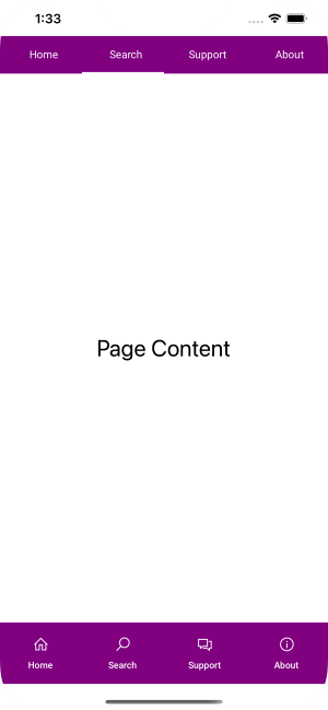
Without SafeArea
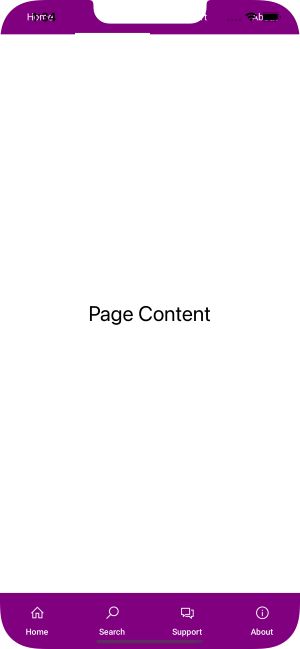
Padding (default)
Top TabBar:
<utu:TabBar Background="Purple"
+           utu:SafeArea.Insets="Top">
Bottom TabBar:
<utu:TabBar Grid.Row="2"
+           utu:SafeArea.Insets="Bottom"
            Background="Purple">
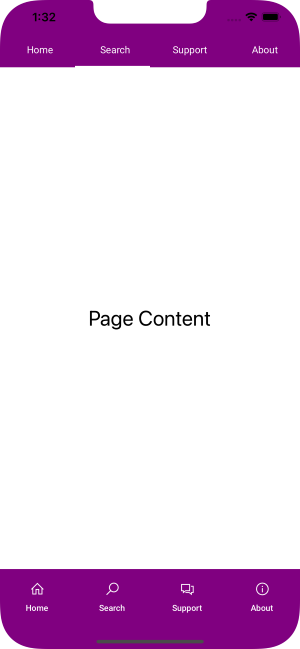
Margin
Top TabBar:
<utu:TabBar Background="Purple"
+           utu:SafeArea.Insets="Top"
+           utu:SafeArea.Mode="Margin">
Bottom TabBar:
<utu:TabBar Grid.Row="2"
+           utu:SafeArea.Insets="Bottom"
+           utu:SafeArea.Mode="Margin"
            Background="Purple">
Using InsetMask.SoftInput for on-screen keyboards
The InsetMask.SoftInput value is used to ensure that the specified area will adapt to any sort of soft-input panel that may appear, such as the on-screen keyboard on touch devices. Currently, SafeArea is built with the assumption that the soft-input panel would appear at the bottom of the screen.
Warning
Special care must be taken when using InsetMask.SoftInput for Android applications. Combining SafeArea's SoftInput logic within an Activity whose WindowSoftInputMode is set to adjustResize or adjustPan may result in undesired behavior, especially when working with text entry controls such as TextBox or PasswordBox. It is possible to set the WindowSoftInputMode to adjustNothing. More information on Android specific keyboard behaviors can be found here.
Important
While the SafeArea attached properties may be used on any FrameworkElement, it is strongly recommended that, when using the InsetMask.SoftInput flag, you should either:
- Attach
SafeAreaproperties to an existingScrollViewerthat is wrapping the content that you would like to adapt to the on-screen keyboard. - Or, use
SafeAreaas a control and have it wrap the relevant content. The control will automatically include aScrollViewerthat wraps its content as long as theInsetsproperty containsInsetMask.SoftInput.
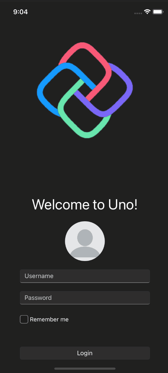
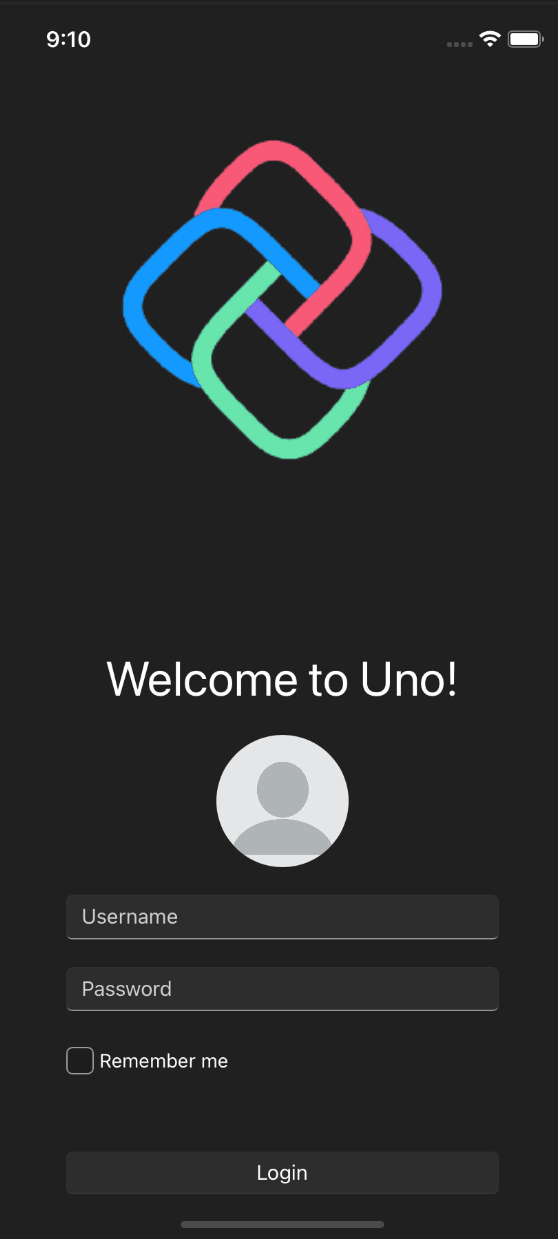
Attempting to use SafeArea to adapt to the keyboard without including a ScrollViewer may not always yield the expected visual result. The behavior of a keyboard-aware SafeArea depends on the structure of the layout. For example, a simple login page like the one below can benefit from SafeArea to ensure that the Username/Password fields, when in focus, are kept visible above the keyboard.
Sample Login Page
Notice in this first example (without SafeArea in use) that the Username and Password field are covered by the keyboard and the UI above the keyboard is not scrollable so the relevant views cannot be brought into the visible frame.
| Page | XAML |
|---|---|
 |
|
In this next example, we attempt to have the UI adapt to the keyboard by attaching the SafeArea.Insets property to the StackPanel that contains the login form. We can see that there is no visual change when compared to the previous example where SafeArea was not present. This is due to the fact that there are "hard" constraints within the XAML, such as the hardcoded Spacer Grid Row and the Auto Row containing Uno logo image.
| Page | XAML |
|---|---|
|
|
The recommended solution in this case would be to use a combination of SafeArea and a ScrollViewer that will wrap your Page content. When using SafeArea as a control, a ScrollViewer is automatically included as the root element of SafeArea as long as the Insets property contains the InsetMask.SoftInput value.
| Page | XAML |
|---|---|
 |
|
There are alternative usages of SafeArea that may be considered in this situation. An example of two alternatives could be:
Have your own ScrollViewer defined within the XAML and then you can simply wrap that
ScrollViewerwith any container, such asGrid, and use theSafeAreaattached properties on that wrapping container.Page XAML <Page ... xmlns:utu="using:Uno.Toolkit.UI"> + <Grid utu:SafeArea.Insets="SoftInput"> + <ScrollViewer> <Grid Padding="50,0"> <!-- 0: Logo, 1: Spacer, 2: FormPanel --> <Grid.RowDefinitions> <RowDefinition Height="Auto" /> <RowDefinition Height="40" /> <RowDefinition Height="*" /> </Grid.RowDefinitions> ... + </Grid> + </ScrollViewer> </Grid> </Page>If you do not want to have the whole page scrollable, you could wrap only the FormPanel
StackPanelwithin aSafeAreainstead of the rootGrid. This may not always have the best visual effect as can be seen in the demonstration belowPage XAML 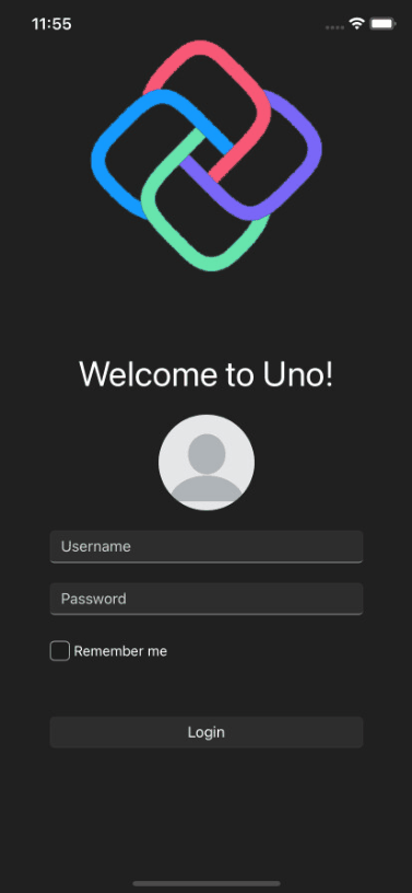
<Page xmlns:utu="using:Uno.Toolkit.UI">
    ...
+    <utu:SafeArea Insets="SoftInput"
+                  Grid.Row="2">
+        <StackPanel Spacing="20">
-                    Grid.Row="2">
            <TextBlock Text="Welcome to Uno!"
                        HorizontalAlignment="Center"
                        FontSize="35" />
            <PersonPicture ProfilePicture="ms-appx:///Assets/profile.png" />
            <TextBox x:Name="TextBox"
                        PlaceholderText="Username" />
            <PasswordBox x:Name="PasswordBox"
                            PlaceholderText="Password" />
            <StackPanel Orientation="Horizontal"
                        Spacing="4">
                <CheckBox Padding="0"
                            MinWidth="0" />
                <TextBlock Text="Remember me"
                            VerticalAlignment="Center" />
            </StackPanel>
            <Button Content="Login"
                    x:Name="LoginBtn"
                    VerticalAlignment="Top"
                    HorizontalAlignment="Stretch"
                    Margin="0,30" />
        </StackPanel>
+    </utu:SafeArea>
    ...
</Page>
Notes
SafeAreais able to adapt to views that are only partially obscured by applying the minimum amount ofPadding/Marginneeded until the content is fully inside the visible bounds.- When a control already has a non-zero
Padding/Margin,SafeAreatakes those values into consideration when calculating the minimum amount of pixels needed for the view to be within the safe area. SafeAreaon WinAppSDK does not have any effect. It is present to allow for same XAML across platforms.