How to use Windows Community Toolkit - Version 8.x
This tutorial will walk you through adding and implementing the SettingsCard control but the same steps can be followed for other* Windows Community Toolkit controls version 8.x.
* See the non-Windows platform compatibility section for more details.
Note
The complete source code that goes along with this guide is available in the unoplatform/Uno.Samples GitHub repository - SettingsCard Sample
Prerequisites
For a step-by-step guide to installing the prerequisites for your preferred IDE and environment, consult the Get Started guide.
Tip
If you are unsure of the version of the Windows Community Toolkit to use between v7 and v8, make sure to read the details about the Windows Community Toolkit migration guide.
NuGet Packages
Uno Platform is now supported out of the box by the Windows Community Toolkit and Windows Community Toolkit Labs starting with version 8.x.
Important
If you are already using Windows Community Toolkit version 7.x in your Uno Platform project and want to update to version 8.x, note that Uno Platform has its own fork of the Windows Community Toolkit for version 7.x.
In your project, these Windows Community Toolkit Uno packages were referenced behind a conditional to allow for use on Windows, Android, iOS, Linux, and WebAssembly.
Conditional references are no longer necessary with version 8.x, you can remove the Uno Windows Community Toolkit references and all Condition statements around the packages.
Referencing the Windows Community Toolkit
When using the Uno Platform solution templates, add the following to your application:
Install the NuGet package(s) reference(s) that you need
- Single Project Template [WinUI / WinAppSDK]
- Multi-Head Project Template (Legacy) [WinUI / WinAppSDK]
- Shared Project (.shproj) Template (Legacy) [WinUI / WinAppSDK]
Edit your project file
PROJECT_NAME.csprojand add the needed reference(s):<ItemGroup> <PackageReference Include="CommunityToolkit.WinUI.Controls.SettingsControls" /> <!-- Add more community toolkit references here --> </ItemGroup>Edit
Directory.Packages.propsand add the needed reference(s):<ItemGroup> <PackageVersion Include="CommunityToolkit.WinUI.Controls.SettingsControls" Version="8.1.240916" /> <!-- Add more community toolkit references here --> </ItemGroup>
Note
Windows Community Toolkit version 8.x requires an update to Windows SDK 10.0.22621 and above, along with Microsoft.WindowsAppSDK updated to the latest matching version.
To override these versions within a single project structure, you can set the properties in the
Directory.Build.propsfile or directly in your project'scsprojfile. For more detailed information, please see the implicit packages details.For example, in
PROJECT_NAME.csproj:<TargetFrameworks> <!-- Code for other TargetFrameworks omitted for brevity --> net9.0-windows10.0.22621; </TargetFrameworks><PropertyGroup> <WindowsSdkPackageVersion>10.0.22621.38</WindowsSdkPackageVersion> <WinAppSdkVersion>1.5.240607001</WinAppSdkVersion> </PropertyGroup>Add the related needed namespace(s)
In XAML:
xmlns:controls="using:CommunityToolkit.WinUI.Controls"In C#:
using CommunityToolkit.WinUI.Controls;
Example with the SettingsCard Control
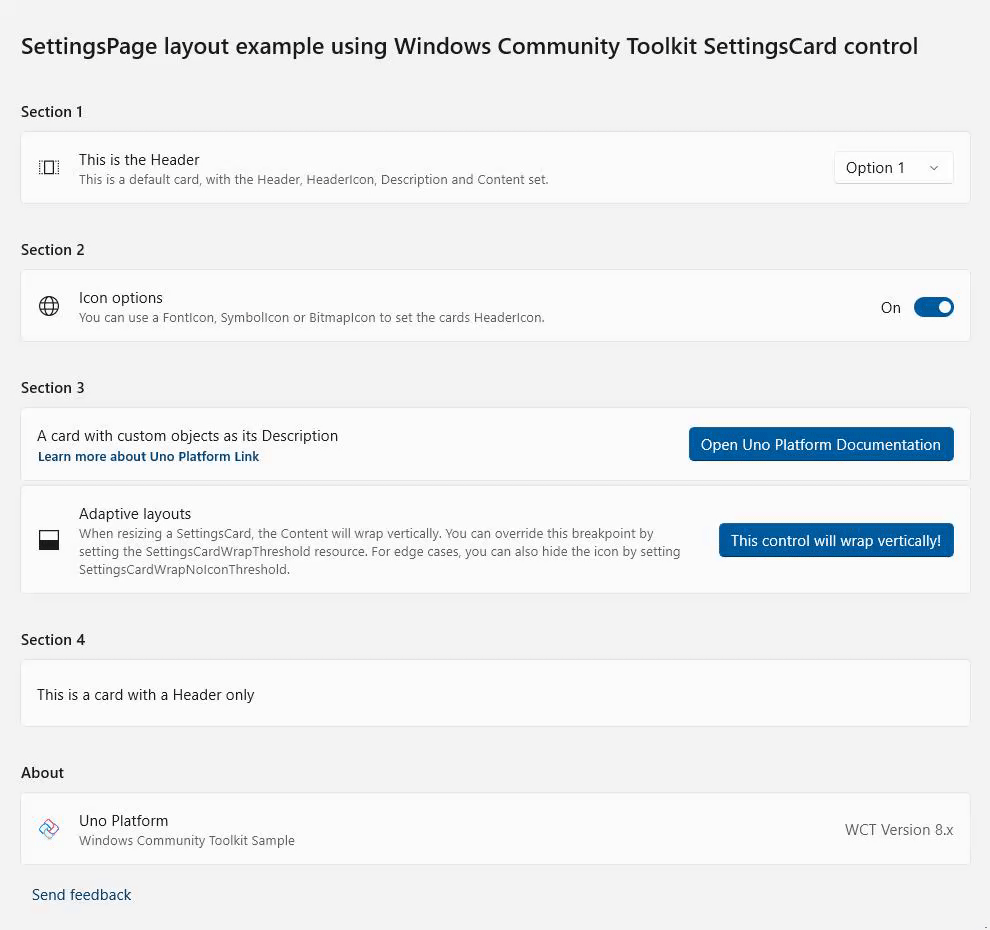
SettingsCard is a control that can be used to display settings in your experience. It uses the default styling found in Windows 11 and is easy to use, meets all accessibility standards and will make your settings page look great!
You can set the Header, HeaderIcon, Description, and Content properties to create an easy to use experience, like so:
<controls:SettingsCard Description="This is a default card, with the Header, HeaderIcon, Description and Content set."
Header="This is the Header">
<controls:SettingsCard.HeaderIcon>
<FontIcon Glyph=""
FontFamily="{ThemeResource SymbolThemeFontFamily}" />
</controls:SettingsCard.HeaderIcon>
<ComboBox SelectedIndex="0">
<ComboBoxItem>Option 1</ComboBoxItem>
<ComboBoxItem>Option 2</ComboBoxItem>
<ComboBoxItem>Option 3</ComboBoxItem>
</ComboBox>
</controls:SettingsCard>
See a working sample with more examples
A complete working sample, along with additional examples, is available on GitHub: Uno Windows Community Toolkit SettingsCard Sample
Using Non-UI Elements from the CommunityToolkit: Converters
The CommunityToolkit provides a collection of ready-to-use converters for various scenarios (e.g., x:Bind in XAML). These converters streamline development by offering implementations for commonly used functionality, eliminating the need to manually create basic converters.
List of CommunityToolkit Converters | Windows Toolkit Documentation
The implementation of these is similar to the example of the SettingsControl above, with some minor adjustments required to use them:
Install the NuGet package reference needed for the converters
Single Project Template [WinUI / WinAppSDK]
Edit your project file
PROJECT_NAME.csprojand add this additional needed reference:<ItemGroup> <PackageReference Include="CommunityToolkit.WinUI.Converters" /> <!-- Add more community toolkit references here --> </ItemGroup>Edit
Directory.Packages.propsand add this additional needed reference:<ItemGroup> <PackageVersion Include="CommunityToolkit.WinUI.Converters" Version="8.1.240916" /> <!-- Add more community toolkit references here --> </ItemGroup>
Add the related needed namespace(s)
In XAML:
xmlns:converters="using:CommunityToolkit.WinUI.Converters"In C#:
using CommunityToolkit.WinUI.Converters;If you are developing an app using C# Markup and want to use the converters, you can refer to the C# Markup Converters Documentation for a detailed usage guide. The general import process is covered from this point onward.
XAML Definition
Unlike the previously seen
SettingsCardcontrol example, it is standard practice to define a converter in thePage.Resourcessection as aStaticResourcebefore using it. This approach ensures that converters, like controls, are properly declared with a namespace and can be easily reused throughout the page.The
StringToVisibilityConverteris a converter that transforms a string value into aVisibilitystate, returningVisibility.Visiblefor non-empty strings andVisibility.Collapsedfor null or empty strings.Define the Converter in Page Resources
Add the converter to the
Page.Resourcessection as aStaticResource:<Page.Resources> <converters:StringToVisibilityConverter x:Key="StringToVisibilityConverter" /> </Page.Resources>Use the Converter in Page Content
Here is an example of how to use the converter in your XAML content:
<TextBlock Text="This text is visible only if the condition is met."
          Visibility="{Binding SomeStringProperty, Converter={StaticResource StringToVisibilityConverter}}"/>
Tip
If you’re running into issues, start by checking our common issues list and the Uno Platform health status.
You can also verify whether there is an ongoing outage affecting Uno Platform online services at: https://status.platform.uno/
If you still need help, reach out via our GitHub Discussions or join our Discord server, where both the engineering team and the community are available to assist you.